Red In Advertisements
Initially, I misunderstood this assignment. I understood it to be ads such as pop-ups we see on websites. After being told otherwise (with a quite unfriendly but justified grade) I redid the assignment. Below is the final assignment.

|
Gatorade
Red and black have a nice contrast, which first pulls your attention to the bottle of Gatorade. Then you notice the fueled text that begins to emphasize the purpose of the drink and then, finally the ad's tagline “dissing” the competitors. It also uses the negative space in the right well to push the “the best. |
|
Target
This ad features a repetitive bullseye in the dog’s face and the top left corner of the advertisement. Not only does this tell the customer to associate the brand with the adorable dog, but it pulls you to the center of the page as that bullseye has the same texture as the dogs face (which is different than the background. As you keep looking at the image, the bottom bar of red is slightly different and does not have the same gradient as the top portion, allowing you to differentiate the tagline from the base image easily. |

|

|
Netflix
This is a billboard ad, so keep in mind it is meant to be seen (more than likely) in broad daylight. The texture of the entire billboard is a solid contrast to the plain and direct “Netflix”. It allows us to see the image from some movies quickly and then quickly see the brand from which you can find the movie. This is also incredibly important on an ad of this type due to the nature of billboards and people generally moving at fast speeds while seeing them. |
|
Coca-Cola
I really enjoy this one for a few reasons. I want to start with the font of the “They don’t make ‘em… etc.” Using a sans-serif font makes you stop at each word and take it in separately. It being in the top left also makes sure you see it first. This, paired with the bolded “we do,” emphasizes their confidence in the product they’re selling. Now moving south, the background red being the same color as the can lets it blend in and not distract from the remainder of the frame. However, when you get down to that portion of the frame, you notice the can and the contrasted white in the logo. |

|
|
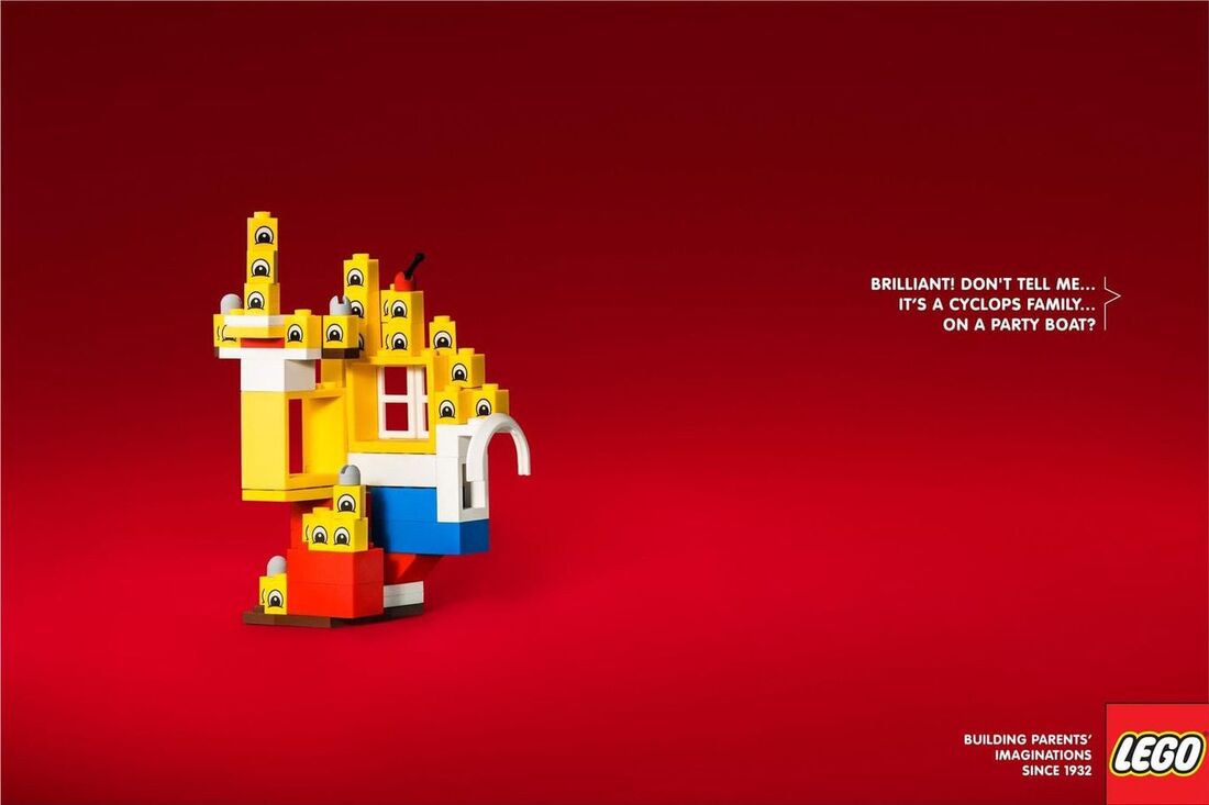
LEGO
The red gradient used in this image strongly contrasts the yellow cyclops LEGO shown on the left. The stronger red centered around the LEGO structure points our attention to the main focal point and then pulls us to the text as it veers into the darker red territory, contrasting the white text. Alongside this, the large amount of negative space makes sure we really see the structure first and are not looking at other places in the frame. |
